Wednesday, September 15, 2010

Designs with Folding

Designing for a flat piece of paper is usually relatively straightforward. You have a rectangular space you fill out with your design. If the piece is two-sided, you take another rectangle with the same dimensions, fill out with another design, and call your two designs front and back.

When your flat piece end up getting folded, things may not be so simple. We'll discuss some of the pitfalls with a tri-fold example.

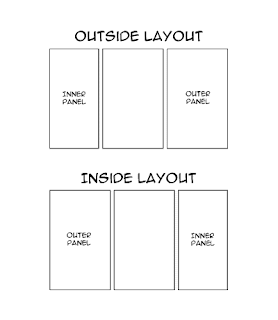
In our folded piece the front becomes the outside and the back becomes the inside. The difference is not just in semantics. In our example, the design space is partitioned into the three panels of a tri-fold. For the outside layout the outermost panel (the first panel seen on the final folded piece) is on the right. For the inside layout, it's on the left. This is important because for a tri-fold panel sizes differ.

Whereas you only need to take into account width and height in a flat piece, you'll also need to consider the thickness of your medium in a folded piece. The inner panel, tucked on the inside, must be designed a bit smaller in width than the other panels so they can wrap around the space it takes up in thickness. The outer panel may also be a bit larger than the middle panel so that its edge protrudes a bit, allowing the reader to open the piece more easily.

Now let's take a look at the trifold, but this time with the fold running horizontally.

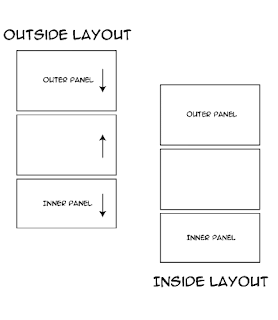
In addition to panel size difference in this design, panel orientation will also differ. Here arrows are drawn for the outside panel, indicating where the top of that panel would be.

Practical considerations
  • Front and back means different things when you're talking about flat and folded pieces. Say you're printing a greeting card with artwork on the outside but nothing on the inside. To you, the final folded piece has artwork on both the front and back. To your printer, who is treating your piece as a flat piece printing-wise, there is only artwork on the front. So pick your pricing option accordingly!
  • If you are using a folding design template, perhaps from your printer, make sure you use the outside design for the outside only, the inside for the inside only. They are not interchangeable!
  • If you are designing from scratch, first make a folding dummy. Mark the front and back of each panel as well as where the top of each panel would be. Once you unfold your dummy you will have a handy reference to each panel's placement and orientation.

Thursday, January 31, 2008

Raster vs. Vector

Here are two basic terms that designers should, but don't always, know. If you are an expert with photoshop or other similar programs you intuitively understand raster graphics. If on the other hand you are familiar with illustrator or autocad, you should understand vector graphics.

Raster

The basis for raster graphics is the pixel. A pixel is basically a dot with color properties. Raster images are just rectangles composed of pixels, arranged in a grid. Pretty much all graphics you see on websites - jpegs, gifs - are raster images.

Vector

The basis for vector graphics is the point. Between two points you can draw a line or a curve, and from those you can draw polygons. Basically it's graphics based on math. As such you can perform transformations such as rotation and scaling on vector graphics with no loss of information.

The difference in nature

One difference is file size. For example, if you want to draw a raster circle, you would need an image with dimensions that can at least circumscribe the circle. Then you need to define each pixel in that image. In a vector image all you need to define the circle is the coordinate of the center point and the radius.

Unless the vector image is inordinately complex, it would have a smaller file size than its rasterized counterpart.

Another difference, which has already touched upon, are the various transformations that can be performed with no loss to vector graphics. Vector objects can be rotated arbitrarily, then rotated back by the same degree and end up the same object. You can also shrink a vector object, then blow it up again, with no loss of detail. Perform these operations on a raster image, however, and you would lose detail. For example, if you shrink an image by 50%, you are basically shoving what used to four pixels worth of information into one pixel per pixel; something is going to be lost. So even if you expand that shrunken image by 200% what you get back would not be the same image as you had originally.

Therefore vector graphics is resolution independent, whereas raster graphics is not - a most important consideration for printing. One common term used in regards to resolution is "dots per inch" or "dpi". Dots in this case would just be pixels. So if you have a raster image measuring 1050 x 600 pixels, and you want to print it as a 3.5 x 2 inches image, the resolution of said image is 300 dpi. If you take the same image and print it as a 7 x 4 inches image, the resolution becomes 15o dpi.

One common mistake people make is thinking an image designed for the web would look just as good printed. Web designers want their graphics to look as good as possible, while being as small as possible, so they try to minimize the number of pixels used. Since many monitors are set to a resolution of 72 dpi, that has become the de facto resolution of web graphics. However, 72 dpi is too low a resolution for printing.

Look at the following image:


The left image is a vector version, while the right one is a 72 dpi raster version. Looks the same, right? If you zoom in at 400%, however:


You can see that the raster image looks pixelated, which is closer to how it would look printed. Notice that the resolution-independent vector version remains just as crisp.

Practical considerations
  • Make sure your raster art is at least 300 dpi; commercials printers should be able to print at this quality at least. In fact modern laser printers can probably print better than that.
  • Logos are best designed as vector art, so it can be used in a variety of pieces of varying dimensions while remaining at maximum quality.
  • Fonts are have both a raster (bitmap) and vector component. If you save a photoshop file in its native .psd format, live type displays as bitmap only, even if importing the file into other programs like indesign. Save it as a .jpg or .gif, all layers (and therefore live text) become flattened and uneditable. Save your photoshop image as a .pdf or .eps and the live text will be vector objects.

Thursday, November 29, 2007

Spreads 101

If you are sending multi-page documents to your printer, you can set the layout of your files in two main ways: as pages and as spreads. If you choose to send spreads, you also have the option of choosing between reader's spread and printer's spread. So what do these terms mean?

Below is an example of an 8-page document:

Pages here refer to the topmost illustration, with the pages laid out separately in the order they are to be read. Reader's spread follow the same convention in that they are laid out in the order to be read, but with the inner pages laid out side by side as if they were one extra large page (called, obviously, a spread). Printer's spread is the hardest to understand. Imagine that your 8-page document has already been printed and stapled together. Take out the staples. Now you have two separate pieces of paper, with a total of four printed sides. The printed side with the cover is the first spread in printer's spread, and the innermost spread is the last spread in printer's spread.

Practical considerations
  • If you are sending spreads to your printer, please remember to specify which format you're using. This is especially important if your document does not have page numbers.
  • Your printer should be able to use any format you send them. If your printer insists on one particular format, you might consider looking at other printers. Particularly if that format is printer's spread.

Sunday, November 18, 2007

white on black = ?

hAVE you ever gotten a job back from your printer and notice something missing? Say a line of white text? You're sure that the text is in the file you sent to your printer. So where did it go?

Overprinting vs Knockout

The two terms refer to a property of color in vector graphic objects, and are mutually exclusive. The difference between overprinting and knockout is akin to photoshop's multiply and normal blend mode, respectively.

When an object is set to overprint, it will let all other colors underneath it come through. When an object is set to knockout, the object will ignore the color information of everything underneath it. A concrete example may help here.


Here we have two lines of text in illustrator, set over a solid field of gray.


The fill property of both lines of text have been set to overprint, found in the attribute palette.


Now turn on overprint preview...


...and see how different things look.

So what exactly happened here?

The second, latte-colored line of text is made of 10% Cyan, 20% Magenta, and 30% Yellow. Because it is set to overprint, the 50% Black field underneath it comes through. As a result its color composition actually becomes 10% Cyan, 20% Magenta, 30% Yellow and 50% Black. That's why it now looks darker.

The first line of white text is made of 0% of all colors. As a result, when it is set to overprint, the text becomes 50% Black - the exact same color as the color surrounding it. That's why it looks as if it's disappeared.

If the lines of text were set to knockout instead, the printing will look like the first screen cap, with none of the gray underneath coming through.

Practical considerations
  • If you are looking at your work in illustrator or acrobat, turn on overprint preview. This is how it will look once printed
  • White fill and stroke should never overprint. You might as well set the color to 'none' in that case
  • Die-lines should always overprint. This is because the die-line will never print on the final piece. But if it's set to knockout, it will knock out all the color underneath it. So what the printer gets is white lines printing where the die-lines would be, which is just as bad as the die-lines actually printing (and that's bad).

Saturday, November 17, 2007

Freely Bleeding

iF you don't work in a printing-related field, you may be forgiven for thinking the title of the site merely cryptic (if catchy). But perhaps you are a small business owner in need of a business card. You have photoshop but no money to hire a designer (likely because you bought photoshop), so you decide to make your own business card. Or maybe you are a designer just starting out, working on your first marketing collateral. You spend hours noodling with your pen tool and filter effects, your text layers and clipping paths. Finally, your masterpiece is perfect, just the way you want it to look on paper.

You send your files off to a commercial printer. Then someone like me promptly sends back an email with the following: "Please send files with bleed."

What is bleed?

Bleed is the part of your art that gets printed - then cut off and discarded in the finished piece. If that sounds confusing, an illustration may help.


In the picture above, the dashed line indicates the border of a business card (the trim edges). The yellow area is the bleed. The black lines near the corners are called crop marks. They are there to let the printer know where to make the cut on the finished piece. Notice that the crop marks are entirely within the bleed. They, along with the rest of the bleed, will be cut off and discarded.

By definition, the bleed is entirely superfluous. So why do printers need it?

In real life, the act of printing on many sheets of paper, then cutting it down, are all mechanical processes with a slight degree of imprecision. Simply put, we don't know exactly what will fall outside the bleed until we have made the final cut.

Here is a partial example of a business card with no bleed:


In a perfect world the cuts will fall right on the edge of the printing, and only the white part will be discarded. But in real life some of those business cards will have edges that look like this instead:


The drop shadow indicates the edge of the final piece. The white slivers are very noticeable, especially on pieces with heavy color saturation.

Here is that same business card, but with bleed:


Unless something goes very wrong, the final piece will have continuous color right up to the edge.

So please make sure your design bleeds. It will make you or your client happier with the final product and willing to pay for it. That in turn makes everyone else happy too.

Practical considerations
  • Your piece should bleed on all four sides
  • The crop marks should not be too close to the trim edge - you don't want weird black marks showing up in the final piece
  • The bleed should be at least 1/8", though you can get away with 1/16"
  • Make your bleed as large as you want. You printer should be able to crop it down as needed.
  • The bleed is free. Nobody should be charged for what's thrown away. If your printer is charging for bleed, switch vendor.