iF you don't work in a printing-related field, you may be forgiven for thinking the title of the site merely cryptic (if catchy). But perhaps you are a small business owner in need of a business card. You have photoshop but no money to hire a designer (likely because you bought photoshop), so you decide to make your own business card. Or maybe you are a designer just starting out, working on your first marketing collateral. You spend hours noodling with your pen tool and filter effects, your text layers and clipping paths. Finally, your masterpiece is perfect, just the way you want it to look on paper.
You send your files off to a commercial printer. Then someone like me promptly sends back an email with the following: "Please send files with bleed."
What is bleed?Bleed is the part of your art that gets printed - then cut off and discarded in the finished piece. If that sounds confusing, an illustration may help.
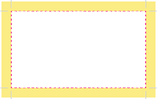
In the picture above, the dashed line indicates the border of a business card (the trim edges). The yellow area is the bleed. The black lines near the corners are called crop marks. They are there to let the printer know where to make the cut on the finished piece. Notice that the crop marks are entirely within the bleed. They, along with the rest of the bleed, will be cut off and discarded.
By definition, the bleed is entirely superfluous. So why do printers need it?
In real life, the act of printing on many sheets of paper, then cutting it down, are all mechanical processes with a slight degree of imprecision. Simply put, we don't know exactly what will fall outside the bleed until we have made the final cut.
Here is a partial example of a business card with no bleed:

In a perfect world the cuts will fall right on the edge of the printing, and only the white part will be discarded. But in real life some of those business cards will have edges that look like this instead:

The drop shadow indicates the edge of the final piece. The white slivers are very noticeable, especially on pieces with heavy color saturation.
Here is that same business card, but with bleed:

Unless something goes very wrong, the final piece will have continuous color right up to the edge.
So please make sure your design bleeds. It will make you or your client happier with the final product and willing to pay for it. That in turn makes everyone else happy too.
Practical considerations
- Your piece should bleed on all four sides
- The crop marks should not be too close to the trim edge - you don't want weird black marks showing up in the final piece
- The bleed should be at least 1/8", though you can get away with 1/16"
- Make your bleed as large as you want. You printer should be able to crop it down as needed.
- The bleed is free. Nobody should be charged for what's thrown away. If your printer is charging for bleed, switch vendor.

 Pages here refer to the topmost illustration, with the pages laid out separately in the order they are to be read. Reader's spread follow the same convention in that they are laid out in the order to be read, but with the inner pages laid out side by side as if they were one extra large page (called, obviously, a spread). Printer's spread is the hardest to understand. Imagine that your 8-page document has already been printed and stapled together. Take out the staples. Now you have two separate pieces of paper, with a total of four printed sides. The printed side with the cover is the first spread in printer's spread, and the innermost spread is the last spread in printer's spread.


